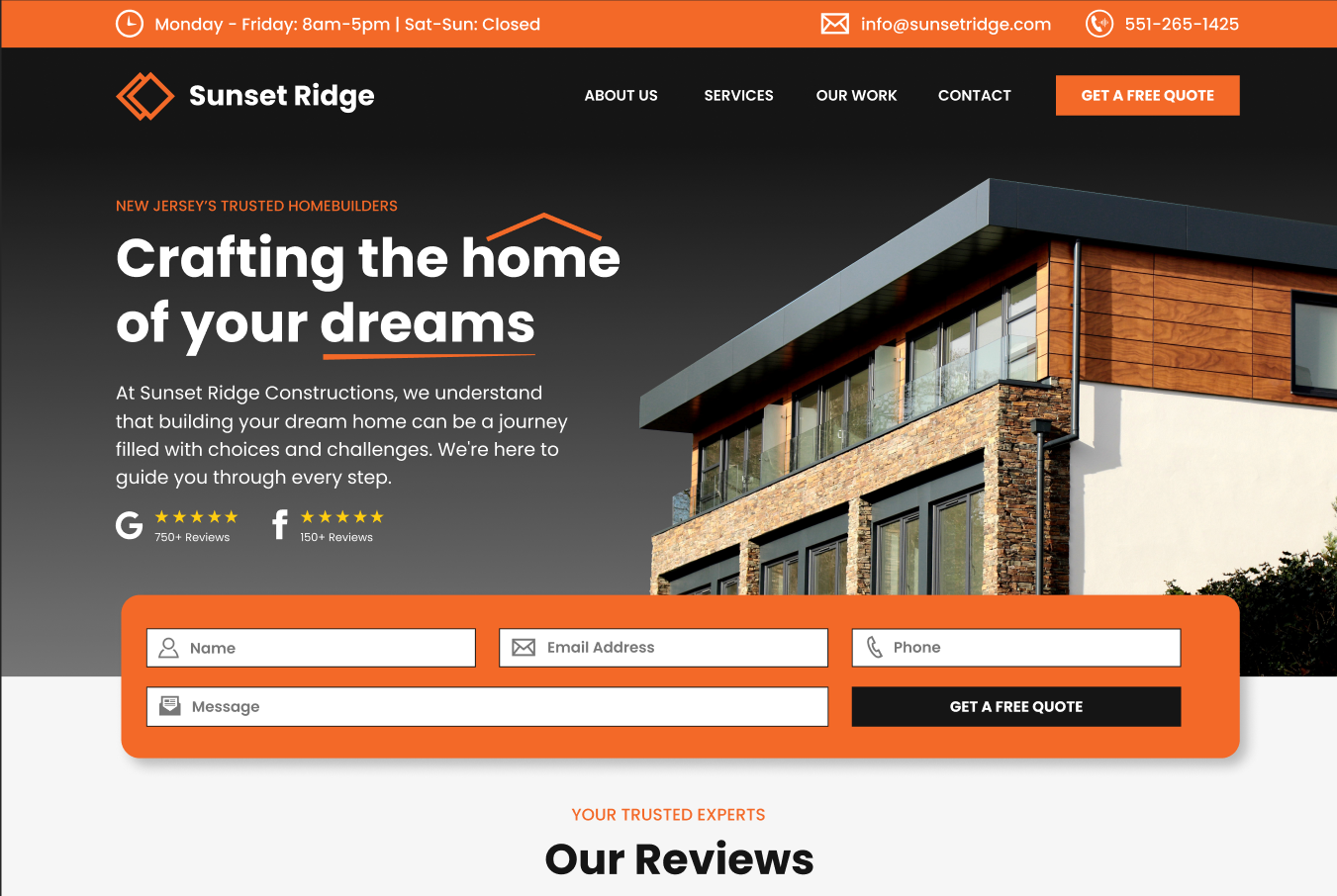
homebuilder web design
A Professional Homebuilder Website Design
This homebuilder websites is built to convert visitors into leads.
I want a website like this
Standing out from the competition with a professional homebuilder website
Here’s the deal with this homebuilder website: It’s built to pull in leads like a magnet and it’s dead simple to use. Here’s what we did:
- Eye-Catching Calls to Action: Bright, bold buttons are everywhere. They say ‘Click Me!’ and guess what? People do. It’s like rolling out a red carpet to leads.
- Contact in a Snap: Got a question? Want a quote? The contact forms is impossible to miss when you land on the homepage. The phone number, email address & hours are right up top where users will look to find them. Easy to find, easy to use. Leads come in hot and fast.
- Establish Credibility: We have the reviews listed right in the hero, showing that this is a trusted company. This coupled with the professional design makes this a company you would want to work with.
- Smooth Sailing: This site is a breeze to navigate, on any device. No squinting, no getting lost. Just smooth browsing that keeps users sticking around.
In short, this homebuilder website isn’t just a digital brochure. It’s a lead-getting, user-friendly powerhouse.

Why Bayshore Digital?

Your website will be truly yours, with a 100% custom design made specifically for your business.

With years of experience in the digital world, our team brings along tons of knowledge and expertise to every project.

Our communication is clear and transparent. We keep you in the loop throughout the entire project.
We stay ahead of the curve, implementing the latest design trends and technologies to give your website a competitive edge.

Our full team is based in the USA. No need to worry about time differences or language barriers.
While we never cut corners, we work FAST!! Ensuring your website is up and running in no time.


